#' ---
#' title: "Data Science and Predictive Analytics (UMich HS650)"
#' subtitle: "Data Visualization
"
#' author: "SOCR/MIDAS (Ivo Dinov)
"
#' date: "`r format(Sys.time(), '%B %Y')`"
#' tags: [DSPA, SOCR, MIDAS, Big Data, Predictive Analytics]
#' output:
#' html_document:
#' theme: spacelab
#' highlight: tango
#' includes:
#' before_body: SOCR_header.html
#' after_body: SOCR_footer_tracker.html
#' toc: true
#' number_sections: true
#' toc_depth: 2
#' toc_float:
#' collapsed: false
#' smooth_scroll: true
#' ---
#'
#' In this chapter, we use a broad range of simulations and hands-on activities to highlight some of the basic data visualization techniques using R. A brief discussion of alternative visualization methods is followed by demonstrations of histograms, density, pie, jitter, bar, line and scatter plots, as well as strategies for displaying trees and graphs and 3D surface plots. Many of these are also used throughout the textbook in the context of addressing the graphical needs of specific case-studies.
#'
#' It is practically impossible to cover all options of every different visualization routine. Readers are encouraged to experiment with each visualization type, change input data and parameters, explore the function documentation using R-help (e.g., `?plot`), and search for new R visualization packages and new functionality, which are continuously being developed.
#'
#' # Questions
#' * What exploratory visualization techniques are available to visually interrogate my specific data?
#' * How to examine paired associations and correlations in a multivariate dataset?
#'
#' #Classification of visualization methods
#' Scientific data-driven or simulation-driven visualization methods are hard to classify. The following list of criteria can be used for classification:
#'
#' * **Data Type**: structured/unstructured, small/large, complete/incomplete, time/space, ASCII/binary, Euclidean/non-Euclidean, etc.
#' * **Task type**: Task type is one of the aspects considered in classification of visualization techniques, which provides means of interaction between the researcher, the data and the display software/platform
#' * **Scalability**: Visualization techniques are subject to some limitations, such as the amount of data that a particular technique can exhibit
#' * **Dimensionality**: Visualization techniques can also be classified according to the number of attributes
#' * **Positioning and Attributes**: the distribution of attributes on the chart may affect the interpretation of the display representation, e.g., correlation analysis, where the relative distance among the plotted attributes is relevant for observation
#' * **Investigative Need**: the specific scientific question or exploratory interest may also determine the type of visualization:
#' +Examining the composition of the data
#' +Exploring the distribution of the data
#' +Contrasting or comparing several data elements, relations, association
#' +Unsupervised exploratory data mining
#'
#' Also, we have the following table for common data visualization methods according to task types:
#'
#' 
#'
#' We chose to introduce common data visualization methods according to this classification criterion, albeit this is not a unique or even broadly agreed upon ontological characterization of exploratory data visualization.
#'
#' #Composition
#'
#' In this section, we will see composition plots for different types of variables and data structures.
#'
#' ## Histograms and density plots
#'
#' One of the first few graphs we learned in high school would be Histogram. In R, the command `hist()` is applied to a vector of values and used for plotting histograms. The famous 19-th century statistician [Karl Pearson](https://en.wikipedia.org/wiki/Karl_Pearson) introduced histograms as graphical representations of the distribution of a sample of numeric data. The histogram plot uses the data to infer and display the probability distribution of the underlying population that the data is sampled from. Histograms are constructed by selecting a certain number of bins covering the range of values of the observed process. Typically, the number of bins for a data array of size $N$ should be equal to $\sqrt{N}$. These bins form a partition (disjoint and covering sets) of the range. Finally, we compute the relative frequency representing the number of observations that fall within each bin interval. The histogram just plots a piece-wise step-function defined over the union of the bin interfaces whose height equals the observed relative frequencies.
#'
#'
#'
set.seed(1)
x<-rnorm(1000)
hist(x, freq=T, breaks = 10)
lines(density(x), lwd=2, col="blue")
t <- seq(-3, 3, by=0.01)
lines(t, 550*dnorm(t,0,1), col="magenta") # add the theoretical density line
#'
#'
#' Here `freq=T` shows the frequency for each *x* value and `breaks` controls for number of bars in our histogram.
#'
#' The shape of last histogram we draw is very close to a Normal distribution (because we sampled from this distribution by `rnorm`). We can add a density line to the histogram.
#'
#'
hist(x, freq=F, breaks = 10)
lines(density(x), lwd=2, col="blue")
#'
#'
#' Here we used the option `freq=F` to make the *y* axis represent the "relative frequency", or "density". We can also use `plot(density(x))` to draw the density plot by itself.
#'
#'
plot(density(x))
#'
#'
#' ## Pie Chart
#'
#' We are all very familiar with pie charts that show us the components of a big "cake". Although pie charts provide effective simple visualization in certain situations, it may also be difficult to compare segments within a pie chart or across different pie charts. Other plots like bar chart, box or dot plots may be attractive alternatives.
#'
#' We will use the Letter Frequency Data on [SOCR website](http://wiki.socr.umich.edu/index.php/SOCR_LetterFrequencyData) to illustrate the use of pie charts.
#'
#'
library(rvest)
wiki_url <- read_html("http://wiki.socr.umich.edu/index.php/SOCR_LetterFrequencyData")
html_nodes(wiki_url, "#content")
letter<- html_table(html_nodes(wiki_url, "table")[[1]])
summary(letter)
#'
#' We can try to plot the frequency for first 10 letters in English. The left hand side plot is the one without reference table and the right one has the table made by function `legend`.
#'
#'
par(mfrow=c(1, 2))
pie(letter$English[1:10], labels=letter$Letter[1:10], col=rainbow(10, start=0.1, end=0.8), clockwise=TRUE, main="First 10 Letters Pie Chart")
pie(letter$English[1:10], labels=letter$Letter[1:10], col=rainbow(10, start=0.1, end=0.8), clockwise=TRUE, main="First 10 Letters Pie Chart")
legend("topleft", legend=letter$Letter[1:10], cex=1.3, bty="n", pch=15, pt.cex=1.8, col=rainbow(10, start=0.1, end=0.8), ncol=1)
#'
#'
#' The input type for `pie()` is a vector of non-negative numerical quantities. In the `pie` function we list the data that we are going to use (positive and numeric), the labels for each of them, and the colors we want to use for each sector. In the `legend` function, we put the location in the first slot and `legend` are the labels for colors. `cex`, `bty`, `pch`, and `pt.cex` are all graphic parameters that we have talked about in **Chapter 1**.
#'
#' More elaborate pie charts, using the Latin letter data, will be demonstrated using `ggplot` below (Section 6.2).
#'
#' ## Heat map
#'
#' Another common data visualization method is the `heat map`. Heat maps can help us visualize the individual values in a matrix intuitively. It is widely used in genetics research and financial applications.
#'
#' We will illustrate the use of heat maps, based on a [neuroimaging genetics case-study data](http://dx.doi.org/10.4306/pi.2015.12.1.125) about the association (p-values) of different brain regions of interest (ROIs) and genetic traits (SNPs) for Alzheimer's disease (AD) patients, subjects with mild cognitive impairment (MCI), and normal controls (NC). First, let's import the data into R. The data are 2D arrays where the rows represent different genetic SNPs, columns represent brain ROIs, and the cell values represent the strength of the SNP-ROI association, a probability values (smaller p-values indicate stronger neuroimaging-genetic associations).
#'
#'
AD_Data <- read.table("https://umich.instructure.com/files/330387/download?download_frd=1", header=TRUE, row.names=1, sep=",", dec=".")
MCI_Data <- read.table("https://umich.instructure.com/files/330390/download?download_frd=1", header=TRUE, row.names=1, sep=",", dec=".")
NC_Data <- read.table("https://umich.instructure.com/files/330391/download?download_frd=1", header=TRUE, row.names=1, sep=",", dec=".")
#'
#'
#' Then we load the R packages we need for heat maps (use `install.packages("package name")` first if you did not install them into your computer).
#'
#'
require(graphics)
require(grDevices)
library(gplots)
#'
#'
#' Then we convert the datasets into matrices.
#'
#'
AD_mat <- as.matrix(AD_Data); class(AD_mat) <- "numeric"
MCI_mat <- as.matrix(MCI_Data); class(MCI_mat) <- "numeric"
NC_mat <- as.matrix(NC_Data); class(NC_mat) <- "numeric"
#'
#'
#' We may also want to set up the row (rc) and column (cc) colors for each cohort.
#'
#'
rcAD <- rainbow(nrow(AD_mat), start = 0, end = 1.0); ccAD<-rainbow(ncol(AD_mat), start = 0, end = 1.0)
rcMCI <- rainbow(nrow(MCI_mat), start = 0, end=1.0); ccMCI<-rainbow(ncol(MCI_mat), start=0, end=1.0)
rcNC <- rainbow(nrow(NC_mat), start = 0, end = 1.0); ccNC<-rainbow(ncol(NC_mat), start = 0, end = 1.0)
#'
#'
#' Finally, we got to the point where we can plot heat maps. As we can see, the input type of `heatmap()` is a numeric matrix.
#'
#'
hvAD <- heatmap(AD_mat, col = cm.colors(256), scale = "column", RowSideColors = rcAD, ColSideColors = ccAD, margins = c(2, 2), main="AD Cohort")
hvMCI <- heatmap(MCI_mat, col = cm.colors(256), scale = "column", RowSideColors = rcMCI, ColSideColors = ccMCI, margins = c(2, 2), main="MCI Cohort")
hvNC <- heatmap(NC_mat, col = cm.colors(256), scale = "column", RowSideColors = rcNC, ColSideColors = ccNC, margins = c(2, 2), main="NC Cohort")
#'
#'
#' In the `heatmap()` function the first argument is for matrices we want to use. `col` is the color scheme; `scale` is a character indicating if the values should be centered and scaled in either the row direction or the column direction, or none ("row", "column", and "none"); `RowSideColors` and `ColSideColors` creates the color names for horizontal side bars.
#'
#' The differences between the AD, MCI and NC heat maps are suggestive of variations of genetic traits or alternative brain regions that may be affected in the three clinically different cohorts.
#'
#' #Comparison
#'
#' Plots used for comparing different individuals, groups of subjects, or multiple units represent another set of popular exploratory visualization tools.
#'
#' ## Paired Scatter Plots
#'
#' Scatter plots use the 2D Cartesian plane to display a pair of variables. 2D points represent the values of the two variables corresponding to the two coordinate axes. The position of each 2D point on is determined by the Values of the first and second variables, which represent the horizontal and vertical axes. If no clear dependent variable exists, either variable can be plotted on the $X$ axis and the corresponding scatter plot will illustrate the degree of correlation (not necessarily causation) between two variables.
#'
#' Basic scatter plots can be plotted by function `plot(x, y)`.
#'
#'
x<-runif(50)
y<-runif(50)
plot(x, y, main="Scatter Plot")
#'
#'
#' `qplot()` is another way to plot fancy scatter plots. We can manage the colors and sizes of dots. The input type for `qplot()` is a data frame. In the following example, larger *x* will have larger dot sizes. We also grouped the data as 10 points per group.
#'
#'
library(ggplot2)
cat <- rep(c("A", "B", "C", "D", "E"), 10)
plot.1 <- qplot(x, y, geom="point", size=5*x, color=cat, main="GGplot with Relative Dot Size and Color")
print(plot.1)
#'
#'
#' Now let's draw a paired scatter plot with 3 variables. The input type for `pairs()` function is a matrix or data frame.
#'
#'
z<-runif(50)
pairs(data.frame(x, y, z))
#'
#'
#' We can see that variable names are on the diagonal of this scatter plot matrix. Each plot uses the column variable as its X-axis and row variable as its Y-axis.
#'
#' Let's see a real word data example. First, we can import the Mental Health Services Survey Data into R, which is on the [class website](https://umich.instructure.com/courses/38100/files/folder/Case_Studies?).
#'
#'
data1 <- read.table('https://umich.instructure.com/files/399128/download?download_frd=1', header=T)
head(data1)
attach(data1)
#'
#' We can see from `head()` that there are a lot of *NA*'s in the dataset. `pairs` automatically deal with this problem.
#'
#'
plot(data1[, 9], data1[, 10], pch=20, col="red", main="qual vs supp")
pairs(data1[, 5:10])
#'
#'
#' First plot is a member of the second scatter matrix. We can see `Focus` and `PostTraum` has no relationship in that `Focus` can equal to 3 or 1 in either `PostTraum` values(0 or 1). On the other hand, larger `supp` tends to have larger `qual` values.
#'
#' To see this trend we can make a plot using `qplot` function. This allow us to add a smooth line for possible trend.
#'
#'
plot.2 <- qplot(qual, supp, data = data1, geom = c("point", "smooth"))
print(plot.2)
#'
#'
#' You can also use the [human height and weight dataset](http://wiki.stat.ucla.edu/socr/index.php/SOCR_Data_Dinov_020108_HeightsWeights) or the [knee pain dataset](http://wiki.socr.umich.edu/index.php/SOCR_Data_KneePainData_041409) to illustrate some interesting scatter plots.
#'
#' ## Jitter plot
#'
#' Jitter plot can help us deal with the overplot issue when we have many points in the data. The function we will be using is still in package `ggplot2` called `position_jitter()`.
#'
#' Still we use the earthquake data for example. We will compare the differences with and without `position_jitter()` function.
#'
#'
# library("xml2"); library("rvest")
wiki_url <- read_html("http://wiki.socr.umich.edu/index.php/SOCR_Data_Dinov_021708_Earthquakes")
html_nodes(wiki_url, "#content")
earthquake <- html_table(html_nodes(wiki_url, "table")[[2]])
plot6.1<-ggplot(earthquake, aes(Depth, Latitude, group=Magt, color=Magt))+geom_point()
plot6.2<-ggplot(earthquake, aes(Depth, Latitude, group=Magt, color=Magt))+geom_point(position = position_jitter(w = 0.3, h = 0.3), alpha=0.5)
print(plot6.1)
print(plot6.2)
#'
#'
#' Note that with option `alpha=0.5` the "crowded" places are darker than the places with only one data point.
#'
#' Sometimes, we need to add text to these points, i.e., add label in `aes` or add `geom_text`. It looks messy.
#'
#'
ggplot(earthquake, aes(Depth, Latitude, group=Magt, color=Magt,label=rownames(earthquake)))+
geom_point(position = position_jitter(w = 0.3, h = 0.3), alpha=0.5)+geom_text()
#'
#'
#' Let's try to fix the overlap of points and labels. We need to add `check_overlap` in `geom_text` and adjust the positions of the text labels with respect to the points.
#'
#'
ggplot(earthquake, aes(Depth, Latitude, group=Magt, color=Magt,label=rownames(earthquake)))+
geom_point(position = position_jitter(w = 0.3, h = 0.3), alpha=0.5)+
geom_text(check_overlap = T,vjust = 0, nudge_y = 0.5, size = 2,angle = 45)
# Or you can simply use the text to deote the positions of points.
ggplot(earthquake, aes(Depth, Latitude, group=Magt, color=Magt,label=rownames(earthquake)))+
geom_text(check_overlap = T,vjust = 0, nudge_y = 0, size = 3,angle = 45)
# Warning: check_overlap will not show those overlaped points. Thus, if you need an analysis at the level of every instance, do not use it.
#'
#'
#' ## Bar Plots
#'
#' Bar plots, or bar charts, represent group data with rectangular bars. There are many variants of bar charts for comparison among categories. Typically, either horizontal or vertical bars are used where one of the axes shows the compared categories and the other axis representing a discrete value. It's possible, and sometimes desirable, to plot bar graphs including bars clustered by groups.
#'
#' In R we have `barplot()` function explicitly designed for these plots. The input for `barplot()` is either a vector or matrix.
#'
#'
x <- matrix(runif(50), ncol=5, dimnames=list(letters[1:10], LETTERS[1:5]))
x
barplot(x[1:4, ], ylim=c(0, max(x[1:4, ])+0.3), beside=TRUE, legend.text = letters[1:4],
args.legend = list(x = "topleft"))
text(labels=round(as.vector(as.matrix(x[1:4, ])), 2), x=seq(1.5, 21, by=1) + rep(c(0, 1, 2, 3, 4), each=4), y=as.vector(as.matrix(x[1:4, ]))+0.1)
#'
#'
#' We can see the methods that adds value labels on each bar is very hard. First, let's figure out how to get the location on x axis `x=seq(1.5, 21, by=1)+ rep(c(0, 1, 2, 3, 4), each=4)`. We know there are 20 bars. The x location for middle of the first bar is 1.5 (there is one empty space before the first bar). Middle of the last bar is 24.5. `seq(1.5, 21, by=1)` start from 1.5 and creates 20 bars that ends with `x=21`. Then we use `rep(c(0, 1, 2, 3, 4), each=4)` to add 0 to the first group, 1 to the second group and so forth. Then, we have the desired position on x-axis. Y-axis is just adding 0.1 to each bar height.
#'
#' We can add standard deviation for the 10 times the means on the bars. To do this we need to use `arrows()` function. When we have the option `angle = 90`, it turns out to be like one side of a box plot.
#'
#'
bar <- barplot(m <- rowMeans(x) * 10, ylim=c(0, 10))
stdev <- sd(t(x[1:4, ]))
arrows(bar, m, bar, m + stdev, length=0.15, angle = 90)
#'
#'
#' Let's look at a more complex example. We utilize the dataset [Case_04_ChildTrauma](https://umich.instructure.com/courses/38100/files/folder/Case_Studies?) for illustration. This case study examines associations between post-traumatic psychopathology and service utilization by trauma-exposed children.
#'
#'
data2 <- read.table('https://umich.instructure.com/files/399129/download?download_frd=1', header=T)
attach(data2)
head(data2)
#'
#'
#' We have two character variables. Our goal is to draw a bar plot comparing the means of `age` and `service` among different races in this study and we want add standard deviation for each bar. The first thing to do is deleting the two character columns. Remember the input for `barplot()` is numerical vector or matrix. However, we will need race information for classification. Thus, we store it in a different dataset.
#'
#'
data2.sub <- data2[, c(-5, -6)]
data2<-data2[, -6]
#'
#'
#' Then, we are ready to separate groups and get group means.
#'
#'
data2.matrix <- as.data.frame(data2)
Blacks <- data2[which(data2$race=="black"), ]
Other <- data2[which(data2$race=="other"), ]
Hispanic <- data2[which(data2$race=="hispanic"), ]
White <- data2[which(data2$race=="white"), ]
B <- c(mean(Blacks$age), mean(Blacks$service))
O <- c(mean(Other$age), mean(Other$service))
H <- c(mean(Hispanic$age), mean(Hispanic$service))
W <- c(mean(White$age), mean(White$service))
x <- cbind(B, O, H, W)
x
#'
#'
#' Until now, we had a numerical matrix for the means available for plotting. Now, we can compute a second order statistics - standard deviation, and plot it along with the means, to illustrate the amount of dispersion for each variable.
#'
#'
bar <- barplot(x, ylim=c(0, max(x)+2.0), beside=TRUE,
legend.text = c("age", "service") , args.legend = list(x = "right"))
text(labels=round(as.vector(as.matrix(x)), 2), x=seq(1.4, 21, by=1.5), #y=as.vector(as.matrix(x[1:2, ]))+0.3)
y=11.5)
m <- x; stdev <- sd(t(x))
arrows(bar, m, bar, m + stdev, length=0.15, angle = 90)
#'
#'
#' Here, we want the y margin to be little higher than the greatest value (`ylim=c(0, max(x)+2.0)`) because we need to leave space for value labels. Now we can easily notice that Hispanic trauma-exposed children are the youngest in terms of average age and they are less likely to utilize services like primary care, emergency room, outpatient therapy, outpatient psychiatrist, etc.
#'
#' Another way to plot bar plots is to use `ggplot()` in the ggplot package. This kind of bar plots are quite different from the one we introduced previously. It plot the counts of character variables rather than the means of numerical variables. It takes the values from a `data.frame`. Unlike `barplot()` drawing bar plots from `ggplot2` requires to remain the character variables in the original data frame.
#'
#'
library(ggplot2)
data2 <- read.table('https://umich.instructure.com/files/399129/download?download_frd=1', header=T)
bar1 <- ggplot(data2, aes(race, fill=race)) + geom_bar()+facet_grid(. ~ traumatype)
print(bar1)
#'
#'
#' This plot help us to compare the occurrence of different types of child-trauma among different races.
#'
#' ## Trees and Graphs
#'
#' In general, a [graph](https://en.wikipedia.org/wiki/Graph_(discrete_mathematics)) is an ordered pair $G = (V, E)$ of vertices ($V$). i.e., nodes or points, and a set edges ($E$), arcs or lines connecting pairs of nodes in $V$. A [tree](https://en.wikipedia.org/wiki/Tree_(graph_theory)) is a special type of acyclic graph that does not include looping paths. Visualization of graphs is critical in many biosocial and health studies and we will see examples throughout this textbook.
#'
#' In **Chapter 9** and **Chapter 12** we will learn more about how to build tree models and other clustering methods, and in **Chapter 22**, we will discuss deep learning and neural networks, which have direct graphical representation.
#'
#' This section will be focused on displaying tree graphs. We will use [02_Nof1_Data.csv](https://umich.instructure.com/courses/38100/files/folder/data) for this demonstration.
#'
#'
data3<- read.table("https://umich.instructure.com/files/330385/download?download_frd=1", sep=",", header = TRUE)
head(data3)
#'
#'
#' We use `hclust` to build the hierarchical cluster model. `hclust` takes only inputs that have dissimilarity structure as produced by `dist()`. Also, we use `ave` method for agglomeration. Then we can plot our first tree graph.
#'
#'
hc<-hclust(dist(data3), method='ave')
par (mfrow=c(1, 1))
plot(hc)
#'
#'
#' When we have no limit for maximum cluster groups, we will get the above graph, which is miserable to look at. Luckily, `cutree` will help us to set limitations to number of clusters. `cutree()` takes a `hclust` object and returns a vector of group indicators for all observations.
#'
#'
require(graphics)
mem <- cutree(hc, k = 10)
# mem; # to print the hierarchical tree labels for each case
# which(mem==5) # to identify which cases belong to class/cluster 5
#To see the number of Subjects in which cluster:
# table(cutree(hc, k=5))
#'
#'
#' Then, we can get the mean of each variable within groups by the following for loop.
#'
#'
cent <- NULL
for(k in 1:10){
cent <- rbind(cent, colMeans(data3[mem == k, , drop = FALSE]))
}
#'
#'
#' Now we can plot the new tree graph with 10 groups. With `members=table(mem)` option, the matrix is taken to be a dissimilarity matrix between clusters instead of dissimilarities between singletons and members gives the number of observations per cluster.
#'
#'
hc1 <- hclust(dist(cent), method = "ave", members = table(mem))
plot(hc1, hang = -1, main = "Re-start from 10 clusters")
#'
#'
#' ## Correlation Plots
#'
#' The `corrplot` package enables the graphical display of a correlation matrix, and confidence intervals, along with some tools for matrix reordering. There are seven visualization methods (parameter method) in `corrplot` package, named "circle", "square", "ellipse", "number", "shade", "color", "pie".
#'
#' Let's use [03_NC_SNP_ROI_Assoc_P_values.csv](https://umich.instructure.com/courses/38100/files/folder/data?) again to investigate the associations among SNPs using correlation plot.
#'
#' The `corrplot()` function we will be using takes correlation matrix only. So we need to get the correlation matrix of our data first via `cor()` function.
#'
#'
# install.packages("corrplot")
library(corrplot)
NC_Associations_Data <- read.table("https://umich.instructure.com/files/330391/download?download_frd=1", header=TRUE, row.names=1, sep=",", dec=".")
M <- cor(NC_Associations_Data)
M[1:10, 1:10]
#'
#'
#' We will discover the difference among different methods under `corrplot`.
#'
#'
corrplot(M, method = "circle", title = "circle", tl.cex = 0.5, tl.col = 'black', mar=c(1, 1, 1, 1))
# par specs c(bottom, left, top, right) which gives the margin size specified in inches
corrplot(M, method = "square", title = "square", tl.cex = 0.5, tl.col = 'black', mar=c(1, 1, 1, 1))
corrplot(M, method = "ellipse", title = "ellipse", tl.cex = 0.5, tl.col = 'black', mar=c(1, 1, 1, 1))
corrplot(M, method = "pie", title = "pie", tl.cex = 0.5, tl.col = 'black', mar=c(1, 1, 1, 1))
corrplot(M, type = "upper", tl.pos = "td",
method = "circle", tl.cex = 0.5, tl.col = 'black',
order = "hclust", diag = FALSE, mar=c(1, 1, 0, 1))
corrplot.mixed(M, number.cex = 0.6, tl.cex = 0.6)
#'
#'
#' The shades are different and darker dots represent high correlation of the two variables corresponding to the x and y axes.
#'
#' # Relationships
#'
#' ## Line plots using `ggplot`
#'
#' [Line charts](https://en.wikipedia.org/wiki/Line_chart) display a series of data points (e.g., observed intensities ($Y$) over time ($X$)) by connecting them with straight-line segments. These can be used to either track temporal changes of a process or compare the trajectories of multiple cases, time series or subjects over time, space, or state.
#'
#' In this section, we will utilize the Earthquakes dataset on [SOCR website](http://wiki.socr.umich.edu/index.php/SOCR_Data_Dinov_021708_Earthquakes). It records information about earthquakes that occurred between 1969 and 2007 with magnitudes larger than 5 on the [Richter scale](https://simple.wikipedia.org/wiki/Richter_scale).
#'
#'
# library("xml2"); library("rvest")
wiki_url <- read_html("http://wiki.socr.umich.edu/index.php/SOCR_Data_Dinov_021708_Earthquakes")
html_nodes(wiki_url, "#content")
earthquake<- html_table(html_nodes(wiki_url, "table")[[2]])
#'
#'
#' In this dataset, we set `Magt`(magnitude type) as groups. We will draw a "Depth vs Latitude" line plot from this dataset. The function we are using is called `ggplot()` under `ggplot2`. The input type for this function is mostly data frame and `aes()` specifies aesthetic mappings of how variables in the data are mapped to visual properties (aesthetics) of the `geom` objects, e.g., lines.
#'
#'
library(ggplot2)
plot4<-ggplot(earthquake, aes(Depth, Latitude, group=Magt, color=Magt))+geom_line()
print(plot4)
#'
#'
#' We can see the most important line of code was made up with 2 parts. The first part `ggplot(earthquake, aes(Depth, Latitude, group=Magt, color=Magt))` specifies the setting of the plot: dataset, group and color. The second part specifies we are going to draw lines between data points. In later chapters, we will frequently use package `ggplot2` and the structure under this great package is always `function1+function2`.
#'
#' ## Density Plots
#'
#' We can visualize the distribution for different variables using density plots.
#'
#' The following segment of R code plots the distribution for latitude among different [earthquake magnitude types](http://wiki.socr.umich.edu/index.php/SOCR_Data_Dinov_021708_Earthquakes#Data_Description). Also, it is using `ggplot()` function but combined with `geom_density()`.
#'
#'
# library("ggplot2")
plot5<-ggplot(earthquake, aes(Latitude, group=Magt, newsize=2))+geom_density(aes(color=Magt), size = 2) +
theme(legend.position = 'right',
legend.text = element_text(color= 'black', size = 12, face = 'bold'),
legend.key = element_rect(size = 0.5, linetype='solid'),
legend.key.size = unit(1.5, 'lines'))
print(plot5)
# table(earthquake$Magt) # to see the distribution of magnitude types
#'
#'
#' Note how the green `magt` type (Local (ML) earthquakes) has a peak at latitude $37.5$, which represents [37-38 degrees North](https://en.wikipedia.org/wiki/37th_parallel_north).
#'
#' #Distributions
#'
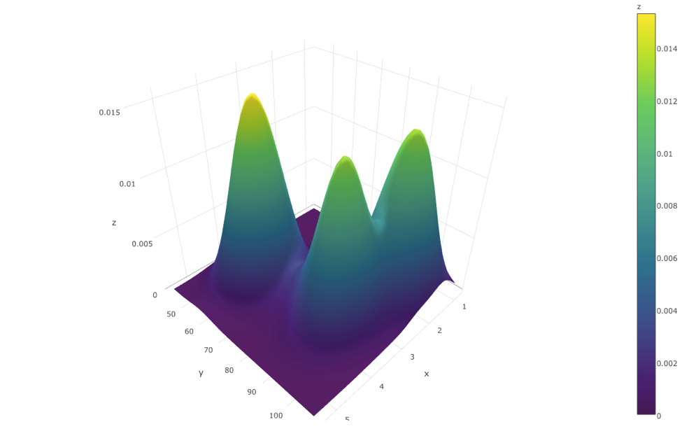
#' ## 2D Kernel Density and 3D Surface Plots
#'
#' [Density estimation](https://en.wikipedia.org/wiki/Density_estimation) is the process of using observed data to compute an estimate of the underlying process' probability density function. There are several approaches to obtain density estimation, but the most basic technique is to use a rescaled histogram.
#'
#' Plotting 2D Kernel Density and 3D Surface plots is very important and useful in multivariate exploratory data analytics.
#'
#' We will use `plot_ly()` function under `plotly` package, which takes value from a data frame.
#'
#' To create a surface plot, we use two vectors: *x* and *y* with length *m* and *n* respectively. We also need a matrix: *z* of size $m\times n$. This *z* matrix is created from matrix multiplication between *x* and *y*.
#'
#' To plot the 2D Kernel Density estimation plot we will use the eruptions data from the "Old Faithful" geyser in Yellowstone National Park, Wyoming stored under `geyser`. Also, `kde2d()` function is needed for 2D kernel density estimation.
#'
#'
kd <- with(MASS::geyser, MASS::kde2d(duration, waiting, n = 50))
kd$x[1:5]
kd$y[1:5]
kd$z[1:5, 1:5]
#'
#'
#' Here `z=t(x)%*%y`. Then we apply `plot_ly` to the list `kd` via `with()` function.
#'
#'
library(plotly)
with(kd, plot_ly(x=x, y=y, z=z, type="surface"))
#'
#' 
#'
#' Note we used the option `"surface"`.
#'
#' For 3D surfaces, we have a built-in dataset in R called `volcano`. It records the volcano height at location x, y (longitude, latitude). Because *z* is always made from *x* and *y*, we can simply specify *z* to get the complete surface plot.
#'
#'
volcano[1:10, 1:10]
plot_ly(z=volcano, type="surface")
#'
#' 
#'
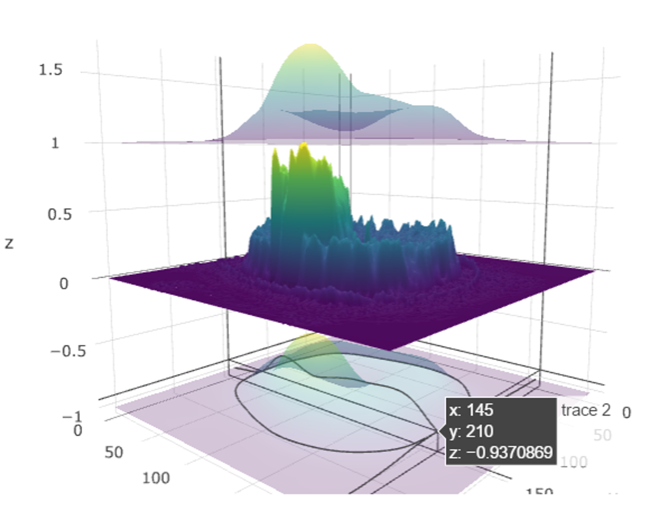
#' ## Multiple 2D image surface plots
#'
#'
#install.packages("jpeg") ## if necessary
library(jpeg)
# Get an image file downloaded (default: MRI_ImageHematoma.jpg)
img_url <- "https://umich.instructure.com/files/1627149/download?download_frd=1"
img_file <- tempfile(); download.file(img_url, img_file, mode="wb")
img <- readJPEG(img_file)
file.info(img_file)
file.remove(img_file) # cleanup
img <- img[, , 1] # extract the first channel (from RGB intensity spectrum) as a univariate 2D array
# install.packages("spatstat")
# package spatstat has a function blur() that applies a Gaussian blur
library(spatstat)
img_s <- as.matrix(blur(as.im(img), sigma=10)) # the smoothed version of the image
z2 <- img_s + 1 # abs(rnorm(1, 1, 1)) # Upper confidence surface
z3 <- img_s - 1 # abs(rnorm(1, 1, 1)) # Lower confidence limit
# Plot the image surfaces
p <- plot_ly(z=img, type="surface", showscale=FALSE) %>%
add_trace(z=z2, type="surface", showscale=FALSE, opacity=0.98) %>%
add_trace(z=z3, type="surface", showscale=FALSE, opacity=0.98)
p # Plot the mean-surface along with lower and upper confidence services.
#'
#'
#' 
#'
#' ## 3D and 4D Visualizations
#' Many datasets have intrinsic multi-dimensional characteristics. For instance, the human body is a 3D solid of matter (3 spatial dimensions can be used to describe the position of every component, e.g., [sMRI volume](https://en.wikipedia.org/wiki/Magnetic_resonance_imaging)) that changes over time (the fourth dimension, e.g., [fMRI hypervolumes](https://en.wikipedia.org/wiki/Functional_magnetic_resonance_imaging)).
#'
#' The [SOCR BrainViewer](http://socr.umich.edu/HTML5/BrainViewer/) shows how to use a web-browser to visualize 2D cross-sections of 3D volumes, display volume-rendering, and show 1D (e.g., 1-manifold curses embedded in 3D) and 2D (e.g., surfaces, shapes) models jointly into the same 3D scene.
#'
#' We will now illustrate an example of 3D/4D visualization in `R` using the packages [brainR](https://www.ncbi.nlm.nih.gov/pmc/articles/PMC4911196/) and [rgl](https://cran.r-project.org/web/packages/rgl).
#'
#'
# install.packages("brainR") ## if necessary
require(brainR)
# Test data: http://socr.umich.edu/HTML5/BrainViewer/data/TestBrain.nii.gz
brainURL <- "http://socr.umich.edu/HTML5/BrainViewer/data/TestBrain.nii.gz"
brainFile <- file.path(tempdir(), "TestBrain.nii.gz")
download.file(brainURL, dest=brainFile, quiet=TRUE)
brainVolume <- readNIfTI(brainFile, reorient=FALSE)
brainVolDims <- dim(brainVolume); brainVolDims
# try different levels at which to construct contour surfaces (10 fast)
# lower values yield smoother surfaces # see ?contour3d
contour3d(brainVolume, level = 20, alpha = 0.1, draw = TRUE)
# multiple levels may be used to show multiple shells
# "activations" or surfaces like hyper-intense white matter
# This will take 1-2 minutes to rend!
contour3d(brainVolume, level = c(10, 120), alpha = c(0.3, 0.5),
add = TRUE, color=c("yellow", "red"))
# create text for orientation of right/left
text3d(x=brainVolDims[1]/2, y=brainVolDims[2]/2, z = brainVolDims[3]*0.98, text="Top")
text3d(x=brainVolDims[1]*0.98, y=brainVolDims[2]/2, z = brainVolDims[3]/2, text="Right")
### render this on a webpage and view it!
#browseURL(paste("file://",
# writeWebGL_split(dir= file.path(tempdir(),"webGL"),
# template = system.file("my_template.html", package="brainR"),
# width=500), sep=""))
#'
#'
#' For 4D fMRI time-series, we can load the hypervolumes similarly and then display them:
#'
#'
# See examples here: https://cran.r-project.org/web/packages/oro.nifti/vignettes/nifti.pdf
# and here: http://journals.plos.org/plosone/article?id=10.1371/journal.pone.0089470
fMRIURL <- "http://socr.umich.edu/HTML5/BrainViewer/data/fMRI_FilteredData_4D.nii.gz"
fMRIFile <- file.path(tempdir(), "fMRI_FilteredData_4D.nii.gz")
download.file(fMRIURL, dest=fMRIFile, quiet=TRUE)
(fMRIVolume <- readNIfTI(fMRIFile, reorient=FALSE))
# dimensions: 64 x 64 x 21 x 180 ; 4mm x 4mm x 6mm x 3 sec
fMRIVolDims <- dim(fMRIVolume); fMRIVolDims
time_dim <- fMRIVolDims[4]; time_dim
# Plot the 4D array of imaging data in a 5x5 grid of images
# The first three dimensions are spatial locations of the voxel (volume element) and the fourth dimension is time for this functional MRI (fMRI) acquisition.
image(fMRIVolume, zlim=range(fMRIVolume)*0.95)
hist(fMRIVolume)
# Plot an orthographic display of the fMRI data using the axial plane containing the left-and-right thalamus to approximately center the crosshair vertically
orthographic(fMRIVolume, xyz=c(34,29,10), zlim=range(fMRIVolume)*0.9)
stat_fmri_test <- ifelse(fMRIVolume > 15000, fMRIVolume, NA)
hist(stat_fmri_test)
dim(stat_fmri_test)
overlay(fMRIVolume, fMRIVolume[,,,5], zlim.x=range(fMRIVolume)*0.95)
# overlay(fMRIVolume, stat_fmri_test[,,,5], zlim.x=range(fMRIVolume)*0.95)
# To examine the time course of a specific 3D voxel (say the one at x=30, y=30, z=15):
plot(fMRIVolume[30, 30, 10,], type='l', main="Time Series of 3D Voxel \n (x=30, y=30, z=15)", col="blue")
x1 <- c(1:180)
y1 <- loess(fMRIVolume[30, 30, 10,]~ x1, family = "gaussian")
lines(x1, smooth(fMRIVolume[30, 30, 10,]), col = "red", lwd = 2)
lines(ksmooth(x1, fMRIVolume[30, 30, 10,], kernel = "normal", bandwidth = 5), col = "green", lwd = 3)
#'
#'
#' [Chapter 18](http://www.socr.umich.edu/people/dinov/2017/Spring/DSPA_HS650/notes/18_BigLongitudinalDataAnalysis.html) provides more details about longitutical and time-series data analysis.
#'
#' # Appendix
#' ## Hands-on Activity (Health Behavior Risks)
#'
#'
# load data CaseStudy09_HealthBehaviorRisks_Data
data_2 <- read.csv("https://umich.instructure.com/files/602090/download?download_frd=1", sep=",", header = TRUE)
#'
#'
#' Classify the cases using these variables: "AGE_G" "SEX" "RACEGR3" "IMPEDUC" "IMPMRTL" "EMPLOY1" "INCOMG" "CVDINFR4" "CVDCRHD4" "CVDSTRK3" "DIABETE3" "RFSMOK3" "FRTLT1" "VEGLT1"
#'
#'
data.raw <- data_2[, -c(1, 14, 17)]
# Does the classification match either of these:
# TOTINDA (Leisure time physical activities per month, 1=Yes, 2=No, 9=Don't know/Refused/Missing)
# RFDRHV4 (Heavy alcohol consumption, 1=No, 2=Yes, 9=Don't know/Refused/Missing)
hc = hclust(dist(data.raw), 'ave')
# the agglomeration method can be specified "ward.D", "ward.D2", "single", "complete", "average" (= UPGMA), "mcquitty" (= WPGMA), "median" (= WPGMC) or "centroid" (= UPGMC)
#'
#'
#' Plot clustering diagram
#'
#'
par (mfrow=c(1, 1))
# very simple dendrogram
plot(hc)
summary(data_2$TOTINDA); summary(data_2$RFDRHV4)
cutree(hc, k = 2)
# alternatively specify the height, which is, the value of the criterion associated with the
# clustering method for the particular agglomeration -- cutree(hc, h= 10)
table(cutree(hc, h= 10)) # cluster distribution
#'
#'
#' To identify the number of cases for varying number of clusters
#'
#'
# To identify the number of cases for varying number of clusters we can combine calls to cutree and table
# in a call to sapply -- to see the sizes of the clusters for $2\ge k \ge 10$ cluster-solutions:
# numbClusters=4;
myClusters = sapply(2:5, function(numbClusters)table(cutree(hc, numbClusters)))
names(myClusters) <- paste("Number of Clusters=", 2:5, sep = "")
myClusters
#'
#'
#' Inspect which SubjectIDs are in which clusters:
#'
#To see which SubjectIDs are in which clusters:
table(cutree(hc, k=2))
groups.k.2 <- cutree(hc, k = 2)
sapply(unique(groups.k.2), function(g)data_2$ID[groups.k.2 == g])
#'
#'
#'
#' To see which TOTINDA (Leisure time physical activities per month, 1=Yes, 2=No, 9=Don't know/Refused/Missing) & which RFDRHV4 are in which clusters:
#'
#'
groups.k.3 <- cutree(hc, k = 3)
sapply(unique(groups.k.3), function(g)data_2$TOTINDA [groups.k.3 == g])
sapply(unique(groups.k.3), function(g)data_2$RFDRHV4[groups.k.3 == g])
# Perhaps there are intrinsically 3 groups here e.g., 1, 2 and 9 .
groups.k.3 <- cutree(hc, k = 3)
sapply(unique(groups.k.3), function(g)data_2$TOTINDA [groups.k.3 == g])
sapply(unique(groups.k.3), function(g)data_2$RFDRHV4 [groups.k.3 == g])
# Note that there is quite a dependence between the outcome variables.
plot(data_2$RFDRHV4, data_2$TOTINDA)
# drill down deeper
table(groups.k.3, data_2$RFDRHV4)
#'
#'
#' To characterize the clusters, we can look at cluster summary statistics, like the median, of the variables that were used to perform the cluster analysis. These can be broken down by the groups identified by the cluster analysis. The aggregate function will compute stats (e.g., median) on many variables simultaneously. To look at the median values for the variables we've used in the cluster analysis, broken up by the cluster groups:
#'
#'
aggregate(data_2, list(groups.k.3), median)
#'
#'
#' ## Some additional `ggplot` examples
#'
#' ### Housing Price Data
#' This example uses the [SOCR Home Price Index data of 19 major city in US from 1991-2009](http://wiki.socr.umich.edu/index.php/SOCR_Data_Dinov_091609_SnP_HomePriceIndex).
#'
#'
library(rvest)
# draw data
wiki_url <- read_html("http://wiki.socr.umich.edu/index.php/SOCR_Data_Dinov_091609_SnP_HomePriceIndex")
hm_price_index<- html_table(html_nodes(wiki_url, "table")[[1]])
head(hm_price_index)
hm_price_index <- hm_price_index[, c(-2, -3)]
colnames(hm_price_index)[1] <- c('time')
require(reshape)
hm_index_melted = melt(hm_price_index, id.vars='time') #a common trick for plot, wide -> long format
ggplot(data=hm_index_melted, aes(x=time, y=value, color=variable)) +
geom_line(size=1.5) + ggtitle("HomePriceIndex:1991-2009")
#'
#'
#' ### Modeling the home price index data
#'
#'
#Linear regression and predict
hm_price_index$pred = predict(lm(`CA-SanFrancisco` ~ `CA-LosAngeles`, data=hm_price_index))
ggplot(data=hm_price_index, aes(x = `CA-LosAngeles`)) +
geom_point(aes(y = `CA-SanFrancisco`)) +
geom_line(aes(y = pred), color='Magenta', size=2) + ggtitle("PredictHomeIndex SF - LA")
#'
#'
#' Let's examine some popular `ggplot` graphs.
#'
#'
# install.packages("GGally")
require(GGally)
pairs <- hm_price_index[, 10:15]
head(pairs)
colnames(pairs) <- c("Atlanta", "Chicago", "Boston", "Detroit", "Minneapolis", "Charlotte")
ggpairs(pairs) # you can define the plot design by claim "upper", "lower", "diag" etc.
#'
#'
#' ### Map of the neighborhoods of Los Angeles (LA)
#' This example interrogates data of [110 LA neighborhoods](http://wiki.socr.umich.edu/index.php/SOCR_Data_LA_Neighborhoods_Data), which includes measures of education, income and population demographics.
#'
#' Here, we select the **Longitude** and *Latitude* as the axes, mark these 110 Neighborhoods according to their population, fill out those points according to the income of each area, and label each neighborhood.
#'
#'
library(rvest)
require(ggplot2)
#draw data
wiki_url <- read_html("http://wiki.socr.umich.edu/index.php/SOCR_Data_LA_Neighborhoods_Data")
html_nodes(wiki_url, "#content")
LA_Nbhd_data <- html_table(html_nodes(wiki_url, "table")[[2]])
#display several lines of data
head(LA_Nbhd_data);
theme_set(theme_grey())
#treat ggplot as a variable
#When claim "data", we can access its column directly eg"x = Longitude"
plot1 = ggplot(data=LA_Nbhd_data, aes(x=LA_Nbhd_data$Longitude, y=LA_Nbhd_data$Latitude))
#you can easily add attribute, points, label(eg:text)
plot1 + geom_point(aes(size=Population, fill=LA_Nbhd_data$Income), pch=21, stroke=0.2, alpha=0.7, color=2)+
geom_text(aes(label=LA_Nbhd_data$LA_Nbhd), size=1.5, hjust=0.5, vjust=2, check_overlap = T)+
scale_size_area() + scale_fill_distiller(limits=c(range(LA_Nbhd_data$Income)), palette='RdBu', na.value='white', name='Income') +
scale_y_continuous(limits=c(min(LA_Nbhd_data$Latitude), max(LA_Nbhd_data$Latitude))) +
coord_fixed(ratio=1) + ggtitle('LA Neughborhoods Scatter Plot (Location, Population, Income)')
#'
#'
#' Observe that some areas (e.g., Beverly Hills) have disproportionately higher incomes and notice that the resulting plot resembles this plot
#'
#' 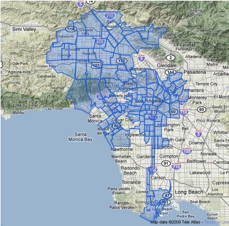.
#'
#' ### Latin letter frequency in different languages
#'
#' This example uses `ggplot` to interrogate the [SOCR Latin letter frequency data](http://wiki.socr.umich.edu/index.php/SOCR_LetterFrequencyData).
#'
#'
library(rvest)
wiki_url <- read_html("http://wiki.socr.umich.edu/index.php/SOCR_LetterFrequencyData")
letter<- html_table(html_nodes(wiki_url, "table")[[1]])
summary(letter)
head(letter)
sum(letter[, -1]) #reasonable
require(reshape)
library(scales)
dtm = melt(letter[, -14], id.vars = c('Letter'))
p = ggplot(dtm, aes(x = Letter, y = value, fill = variable)) +
geom_bar(position = "fill", stat = "identity") +
scale_y_continuous(labels = percent_format())+ggtitle('Pie Chart')
#or exchange
#p = ggplot(dtm, aes(x = variable, y = value, fill = Letter)) + geom_bar(position = "fill", stat = "identity") + scale_y_continuous(labels = percent_format())
p
#gg pie plot actually is stack plot + polar coordinate
p + coord_polar()
#'
#'
#' You can see [some additional Latin Letters plots here](http://wiki.stat.ucla.edu/socr/index.php/SOCR_LetterFrequencyData#Graphs).